The geoconsumption model makes it possible to distribute any type of potential between the points of sale. The proximity of the point of sale, its size and its attractiveness are some of the parameters involved in this distribution.
The model also simulates the effects of opening a new point of sale. This makes it possible to estimate the turnover as well as the impact on the existing points of sale. Thus, you can measure and quantify the effects of the different scenarios and make the decisions that deliver the best results.
Are there plans to close a point of sale? In this case, the geoconsumption model quantifies the probable losses of customers and the possible transfers to nearby points of sale.

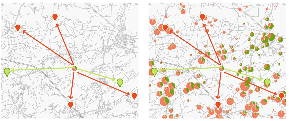
The two maps show the distribution of the market potential. The green symbols represent the analysed points of sale. The red symbols represent the competitors.
Each disc represents the market potential in a census district. The size of the disc is proportional to the value of the market potential.
The green part of the disc is the proportion of the market potential captured by the points of sale in the analysed network. In addition, the red part shows the proportion captured by the competition. This distribution of the market potential is done for all census districts.
A catchment area is a geographical area that surrounds a point of sale and represents the origin of the majority of the customers. This space is also established on a forecast basis, particularly with a view to opening a new point of sale.
With this geomarketing analysis, you can find out the reach of your points of sale and the drivetime of your customers. We then compare this information for all your points of sale. Thus, we distinguish those that have a proximity role from those that cover a wider area.
The analysis of catchment areas also allows you to determine the “average” drivetime for your customers. The strictly quantitative analysis can be enlarged to include a qualitative component using our Mosaic Belgium database.
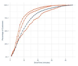
The catchment areas also give an indication of the concentration of customers around points of sale. For example, we observe on the graph that 80% of customers are located no more than 19 minutes from a point of sale.

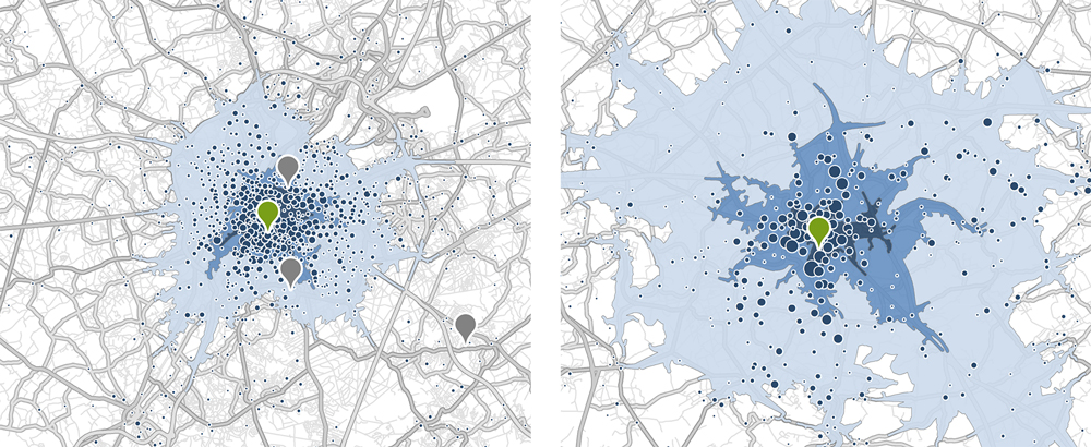
On the map, the green symbol represents the studied point of sale. Around this point, three areas of accessibility are defined: drivetimes of 5 minutes, 10 minutes and 15 minutes. The grey symbols represent the points of sale in the network whose customers are not taken into account on the map. On the same maps you can also observe the customers’ origins by census district in the blue discs.
The orange curves in the second illustration show the percentage of customers located in relation to the drivetime from the point of sale. The longer the drivetime, the higher the percentage of customers covered. The blue curve represents the average of the entire point of sale network.
Mapping customers’ origins allows you to gain a better understanding of where the customers who visit your points of sale come from. This means you can understand whether your point of sale attracts the local population or draws in a more distant population.
This geographical analysis can be performed for a point of sale, a region or the point of sale network. It provides initial information that helps to explain the current functioning of your points of sale.
Additional analyses generally complement the geomarketing study and allow an audit of your point of sale network. Thus, you can also analyse market penetration, catchment areas, competition and population profiles.

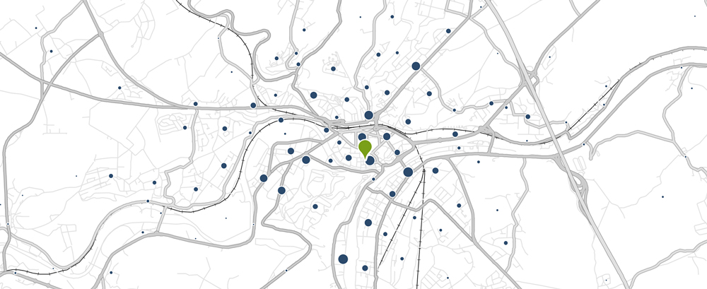
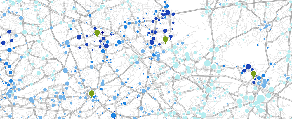
The green symbol on the map represents a point of sale. The blue discs represent the customers living in a census district.
The size of the disc is proportional to the number of customers living in that census district.
The different geomarketing analyses (market penetration, presence of the target group, catchment areas, competitive pressure, market potential, cannibalisation) make it possible to define the market potential very precisely.

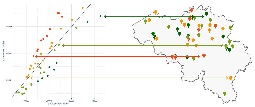
With this new information, we calculate a theoretical turnover for each point of sale, as well as for the other channels. We then compare this theoretical turnover with the actual situation in order to observe the performance of your points of sale.
This allows you to identify the points of sale that are achieving a turnover higher than their market potential. These are real ambassadors in your point of sale network. Reorganise the points of sale whose performance can be improved, or support them with marketing actions. Merge, close or relocate the points of sale whose performance is clearly below their local potential.

In the first graph, we see on the vertical axis the sales calculated by the analytical model. The horizontal axis represents the actual sales. The blue line corresponds to a perfect match between the calculated and actual sales.
In other words, the points of sale on this line are achieving exactly what the model estimates that they should achieve. Above this line, the red points are the points of sale with a performance well below their calculated potential, while the orange points are just slightly below their optimal performance. Below and to the right, the green points show results above the model’s calculations.
The map delivers this information in a geographical context and makes it possible to understand certain issues within the point of sale network.
The second illustration places the points of sale in perspective with the competition and proposes appropriate actions according to the context of each of them.
The penetration rate reflects the market coverage obtained by a product, a service or a point of sale. To this end, we see in this geomarketing study the proportion of the population that visits your points of sale, and you will be able to precisely visualise the area of influence of each of those points of sale.
The market penetration analysis will also allow you to understand the functioning of the network. In this way, you can verify for each point of sale whether it has a preponderantly local or regional role and determine the market coverage. Thus, you will be able to identify areas in your network where the market coverage is lower and expansion is possible.

The green symbols represent the points of sale, and the discs represent the customers living in the census districts. The size of the discs is proportional to the number of customers. Finally, the colour represents the proportion of customers related to the population present within the census district. In other words, the darker the colour, the greater the number of inhabitants in the census district who are customers.
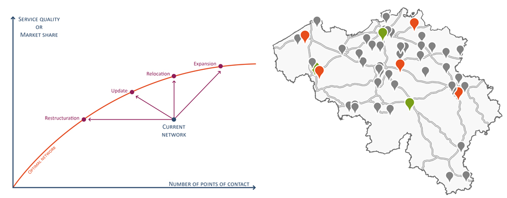
For many companies, the point of sale network is the result of their history and development. The network grows gradually over the years as opportunities arise. Consequently, a point of sale network is never “optimal”. In other words, the points of sale are not placed in such a way as to maximise market share or service quality with a minimum number of points of sale.
When an optimal network is desired, SIRIUS Insight takes care to get close to the “optimal frontier” that gives, for example, the best market share for each size of a point of sale network.
The method used for finding the optimal network determines the number and location of points of sale that allow you to achieve your company’s strategic objectives. In addition, the techniques used make it possible to develop multiple ideal configuration scenarios for your network in the market.
The optimisation model also takes different types of constraints into account: points of sale that cannot move, footfall thresholds, a minimum turnover per point of sale, the company’s expertise and its knowledge of its current network, etc.
At every stage, the model is capable of re-examining all the proposals made. This makes it possible to actually construct an optimal network, even when the number of points of sale or the constraints change.
The culmination of the geomarketing study is a master plan with clear recommendations for the optimal deployment of your point of sale network.

The first graph shows how a point of sale network can approach the “optimal frontier” represented by a red curve. The horizontal axis represents the size of the point of sale network, while the vertical axis represents its result, for example the market share or the service quality.
An optimal network sees its market share increase according to the number of points of sale until it levels off.
The company’s strategic objectives will determine how the network will approach this optimal curve or “frontier”.
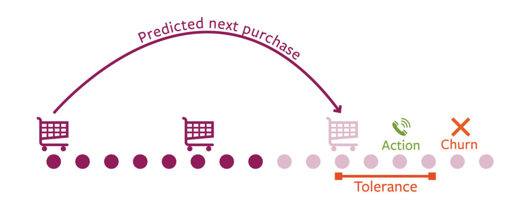
Many retailers have customer cards and loyalty programs. With these tools they increase the client engagement and obtain a detailed view of their (best) customers. However, these cards will not allow them to identify directly the customers whom might churn.
With our analytical models we can pinpoint precisely which customers are at risk. This way you can monitor the size of the risk (for this client, but also for you whole client base) and keep track on its evolution over time. By knowing which triggers lead to churn, personalised actions can be planned to regain their trust even before they leave your company.
With our expertise in geomarketing we have all the necessary data, skills and experience at our disposal to predict the future behaviour of your customers. Learn in this movie how we manage to do this.
The loyalty of customer is caracterised by the purchasing cycle of each client, the category of goods, the volumes of purchases, … In this buying cycle we investigate carefully the frequency of purchases, the visited points of sale, the amounts spent, … Changes in this buying cycle; for example a decrease in the frequency of the purchases; often results in the “sudden” disappearance of the customer.
Many factors influence customer loyalty. It can be the experience of the customer with your company/product, his habits, his sociodemographic characteristics, … A few examples: a high invoice, an outdated product, the age of the customer, his income, a point of sale that has moved or closed, an untreated complaint, a campaign of a competitor, … Merely, a combination of factors explains the “sudden” disappearance of the customer.
In order to predict the future behaviour of your customers we first of all need to analyse and understand current behaviours and habits. By using historical customer data we perform an in depth study of habits and interactions of the customers of your company. Many other parameters are calculated to enrich these findings: distance to a point of sale, purchasing frequency, moment of purchase, average spending, … Finally we match your database with our Mosaic Belgium consumer segmentation in order to add rich sociodemographic information to the customers. By associating and analysing all these insights we determine which triggers result into churn and thus the factors that play an important role in the behaviour of your clients.
The integration of all these elements in a predictive model makes it possible to monitor continuously the risk of churn of your customers and to organise targeted actions.

Organise actions that match perfectly the risky client: adapt the message to his profile, his churn risk and his specific churn triggers and regain his trust! Targeted calls, mailings, promotions, exclusive test experiences, presents, … The more personalised the actions is, the highest the return will be.
With a continuous churn monitoring and personalised actions you will increase loyalty among your customers and thus increase the turnover of your company.
Profiling makes it possible to understand what characterises your customers, the customers for a product, or even your prospects. The value of the process is to improve your offer and communication based on the specific characteristics of your customers. By understanding the characteristics and affinities of your customers, you will know exactly which of them are the most interesting for your business, as well as the arguments that you can put forward to persuade them to buy your products and services.

Understanding the customer is fundamental to the development of any business. Knowing your customers’ needs, motivations, lifestyle, interests and consumption patterns allows you to adapt your offer to their precise needs. The profiling that we offer you at SIRIUS Insight is not limited to the data revealed by loyalty cards, but opens up the scope for action by incorporating numerous socio-demographic and behavioural data present in Mosaic Belgium.
Profiling your customers also helps you to keep your feet on the ground, for example by checking the gap between the target group described in buyer personae and the actual profile of your business’s customers. You will also be able to identify specific customer groups. Study what motivates the most profitable customers, the consumption habits of the customers who buy most frequently, the income classes of customers who buy online, the communication preferences of customers aged 40-45 years, etc.
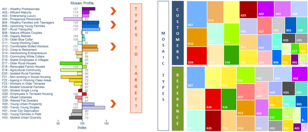
Creating a profile actually consists of comparing a studied group (customers, prospects, etc.) with a reference group (Belgian households, households of a municipality, households in the catchment area concerned, etc.). This way we distinguish the most significant characteristics of the studied group: Do they come from all over, or from certain neighbourhoods? From certain types of housing? Are they the same age? Do they have the same income? Do they buy the same products?
At SIRIUS Insight, we incorporate the power of Mosaic Belgium into the profiling. Our segmentation of Belgian households categorises the population into 8 groups and 33 types. For each of these types and groups, we have information about family composition, income, type of housing and professional background, as well as a wealth of behavioural data relating to online shopping, mobility, media consulted, leisure activities, etc.

When we profile your customers, we assign a Mosaic type to each customer according to where they live. Your customer base is then compared with the existing Mosaic types (nationally or in the catchment area of a point of sale, for example), allowing the identification of overrepresented Mosaic types within your customer base . This makes it possible to define your target group and take into account all the characteristics that we know about this population. Once this is done, the profile will allow you to search for the prospects who are most similar to your customers.
Profiling will provide you with a great deal of information about your customers: the environment in which they live, their family composition, their income, their preferred communication channels and media, their interest in various topics such as organics, football, mountain holidays, online shopping, etc.
This knowledge will enable you to prime the relevant communication channels for each customer and achieve a very high level of message personalisation.
The use of Mosaic Belgium and the availability of segmentation down to the level of each street segment makes it possible to search for the areas where you will find consumers with a profile similar to that of your customer base. The organisation of door-to-door campaigns, bulk mailings, the opening of pop-up stores or participation in local events in these areas will offer many recruitment opportunities.
Cannibalisation is the result of internal competition and causes significant wastage of resources and loss of income in terms of turnover. This effect is often observed with points of sale that are close to each other whose catchment areas overlap, for example due to successive openings.
Avoid wastage of resources by remedying this cannibalisation through internal reorganisation, or even by relocating certain points of sale.
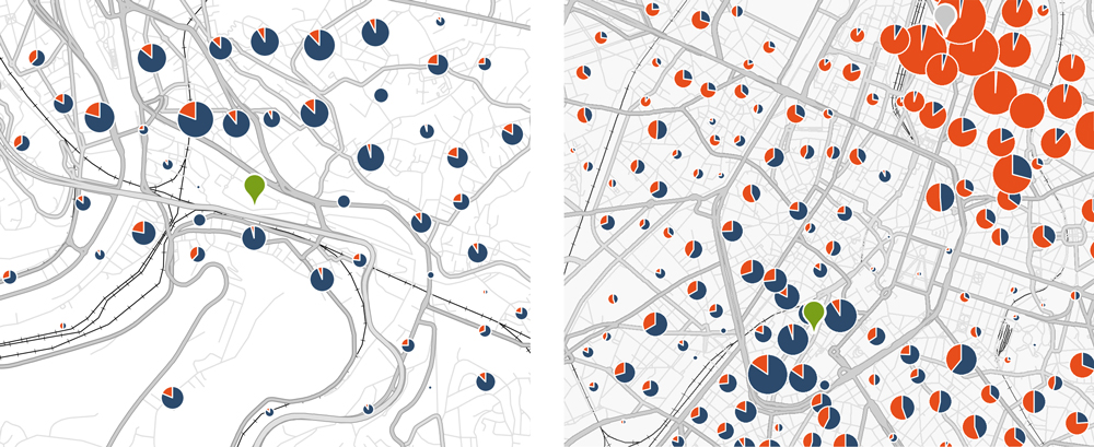
In this geomarketing analysis, SIRIUS Insight primarily studies customer data. To do this, we locate all the customers and analyse the point of sale that they visit.

The green symbol represents the analysed point of sale. The grey symbol (top right) is another point of sale in the same network. The discs represent the customers present within each census district, and their size is proportional to the number of customers. The blue part of the disc shows the proportion of customers who visit the point of sale that we are analysing. The orange part represents the customers who visit another point of sale in the same network.
Thus, we see on the first map that the point of sale has good local leadership. On the second map, we see that the point of sale’s leadership deteriorates rapidly the further we move away from it. A rather substantial cannibalisation effect is observed.
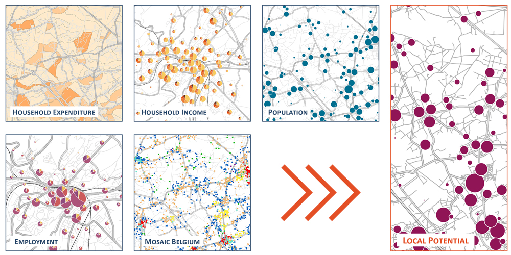
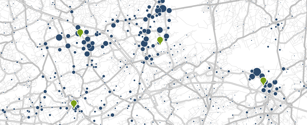
The market potential is the budget spent by the households in a geographical area for a product or service. More specifically, SIRIUS Insight models the spending made by the consumers. The market potential is determined on the basis of detailed data such as income, population, spending in a specific category, Mosaic Belgium, family composition, employment, etc.
In this way, SIRIUS Insight calculates each year, for the 20,000 Belgian census districts, the market potential for numerous products and services such as food, clothing, energy, vehicles, organic products, restaurant visits, household appliances, etc.
This valuable information allows you to perform close monitoring of your market, as well as to estimate turnover for a new location, check performance, determine sales targets, etc. Finally, the geoconsumption model makes it possible to distribute this potential at local level.

The above maps represent different data used for calculating a market potential. In this case, data on household spending, household income, population and employment, as well as Mosaic Belgium information, are used to calculate and locate the market potential.