The different geomarketing analyses (market penetration, presence of the target group, catchment areas, competitive pressure, market potential, cannibalisation) make it possible to define the market potential very precisely.
With this new information, we calculate a theoretical turnover for each point of sale, as well as for the other channels. We then compare this theoretical turnover with the actual situation in order to observe the performance of your points of sale.
This allows you to identify the points of sale that are achieving a turnover higher than their market potential. These are real ambassadors in your point of sale network. Reorganise the points of sale whose performance can be improved, or support them with marketing actions. Merge, close or relocate the points of sale whose performance is clearly below their local potential.

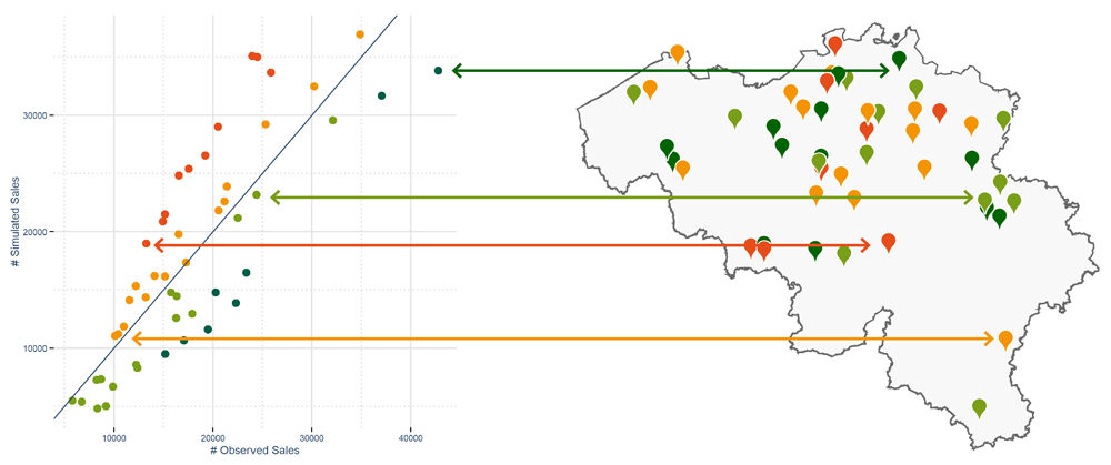
In the first graph, we see on the vertical axis the sales calculated by the analytical model. The horizontal axis represents the actual sales. The blue line corresponds to a perfect match between the calculated and actual sales.
In other words, the points of sale on this line are achieving exactly what the model estimates that they should achieve. Above this line, the red points are the points of sale with a performance well below their calculated potential, while the orange points are just slightly below their optimal performance. Below and to the right, the green points show results above the model’s calculations.
The map delivers this information in a geographical context and makes it possible to understand certain issues within the point of sale network.
The second illustration places the points of sale in perspective with the competition and proposes appropriate actions according to the context of each of them.